Context
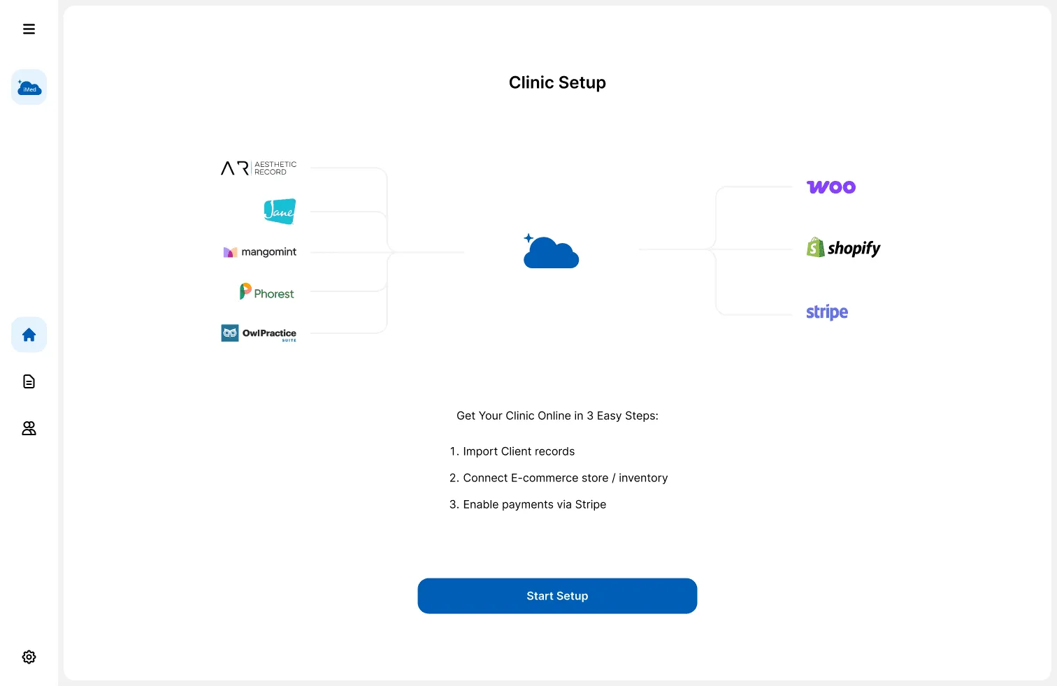
iMed (Intelligent Medical Cloud Inc.) identified a critical operational gap: while industry leaders handled scheduling or clinical notes in silos, none offered a bridge to the e-commerce tools clinics use to sell retail products.
This project involved a complete revision of the legacy registration gateway and the creation of an end-to-end suite for inventory, patient CRM, and automated invoicing.
Problem
The fragmentation gap
Clinic owners were suffering from severe “tab fatigue”. A typical admin spent their day jumping between four disconnected platforms: Shopify for retail, Jane App for patient records, Stripe for billing, and spreadsheets for invoicing. This lack of connectivity caused a massive “revenue leak”: online sales never synced with clinical stock, leading to overselling and hundreds of hours wasted on manual reconciliation.
Process
Continuous iteration (Agile UX)
I used an Agile UX lifecycle to ship core modules while refining the gateway through constant iteration.
- Research: analyzing legacy registration and identifying clinical pain points.
- Design: mapping data relationships and architecting the new suite.
- Develop & deploy: building the suite modules in iterative, functional sprints.
- Test & repeat: validating features with admins and refining based on real-world use.

Research
Market gap analysis
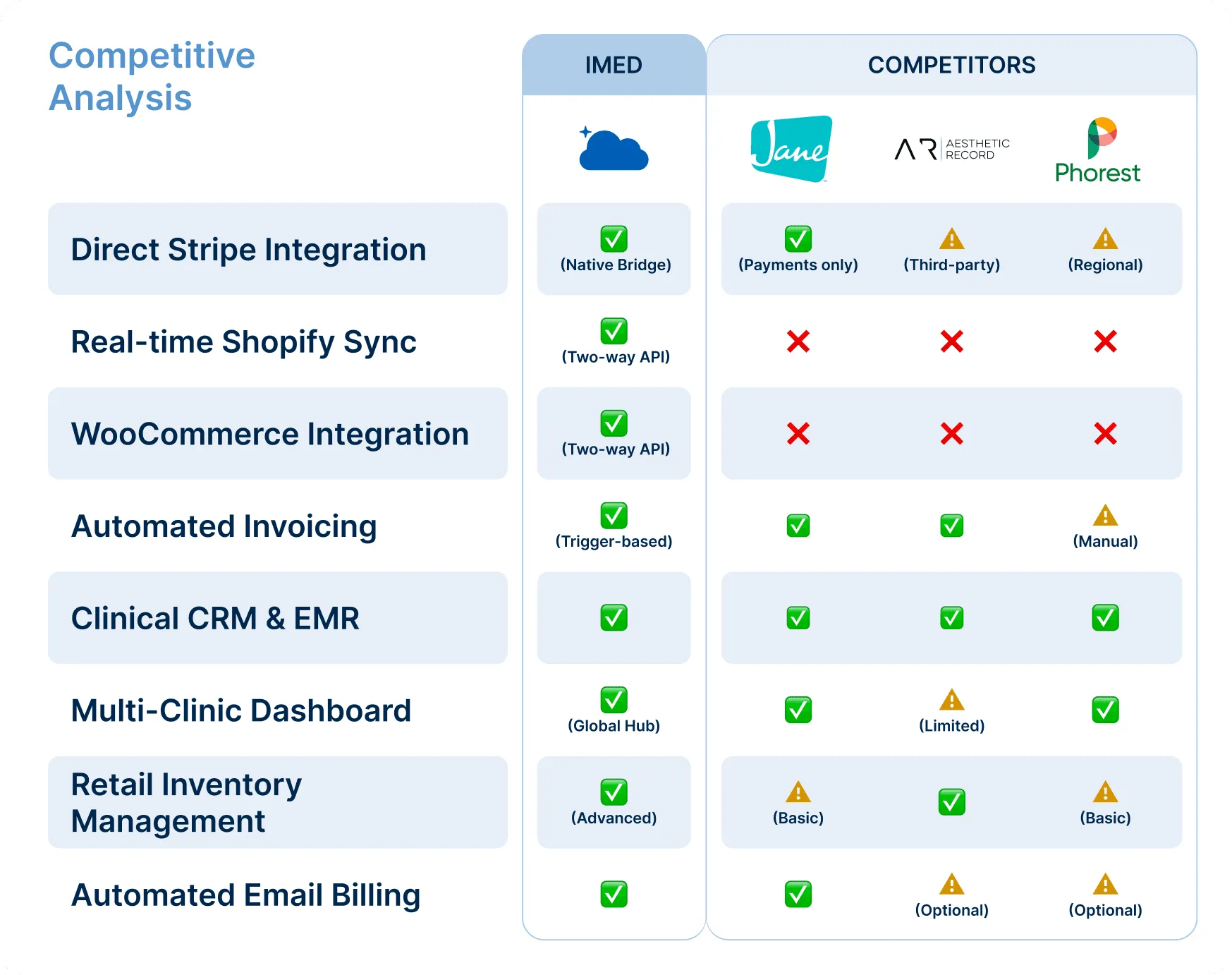
I audited industry leaders like Jane App, Phorest, and Aesthetic Record to understand why they weren’t solving the fragmentation gap.
- Competitive analysis: competitors excelled at scheduling but lacked native, two-way API sync with retail platforms like Shopify and WooCommerce.
- User interviews: admins said their peak frustration was the manual data re-entry needed to link a Shopify sale to a clinic invoice.
A/B testing
Utility over aesthetics
Early on, I designed a modern card-based interface for products, prioritizing visual appeal. I ran an A/B test with clinic admins comparing the card view against a high-density list view.
- Result: 85% of testers preferred the list view. Cards required excessive scrolling and hid critical data like SKU codes and stock alerts.
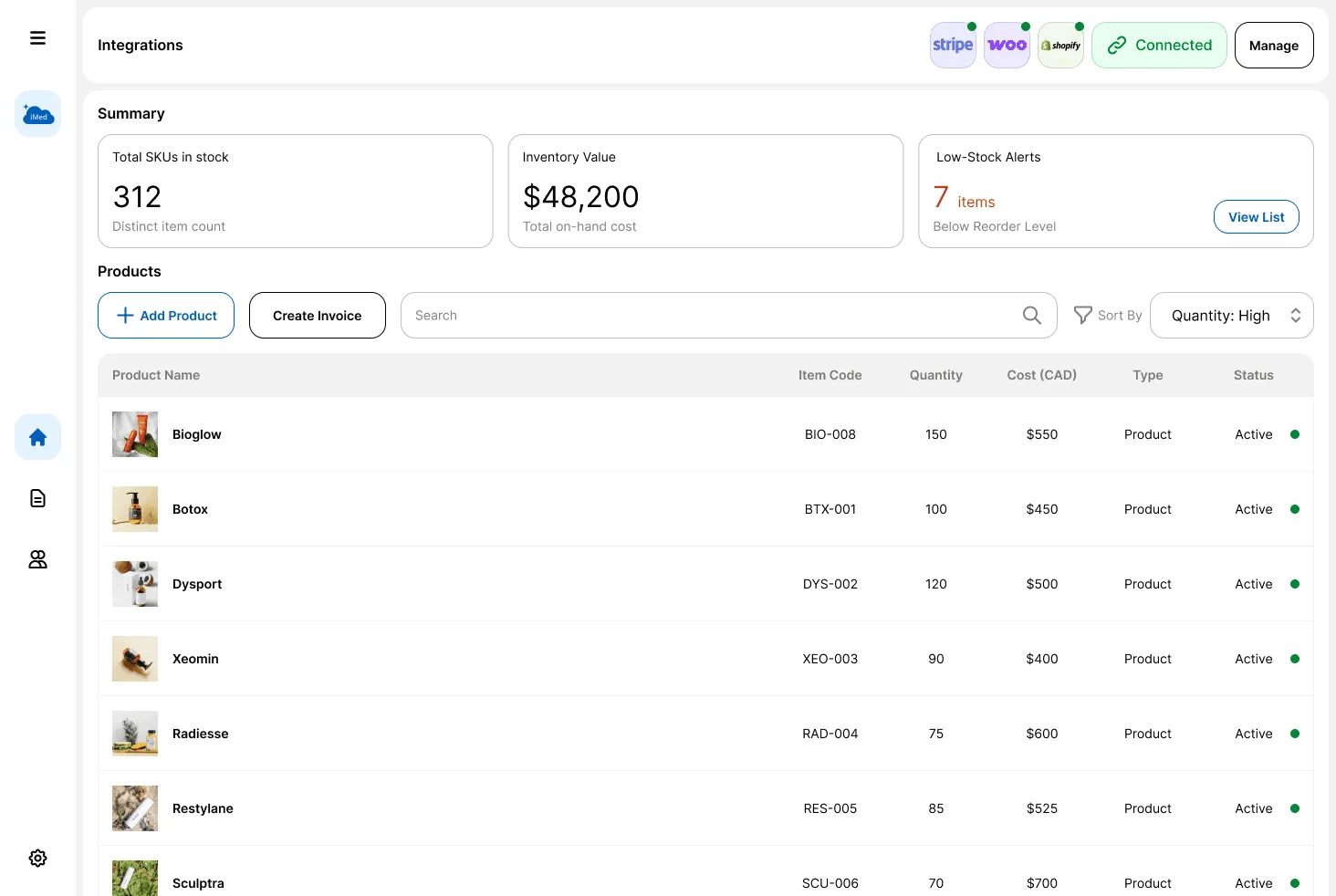
- Decision: I pivoted to a streamlined list, showing that in medical SaaS, data density and utility outweigh visual flair.
Information architecture
Hub and spoke
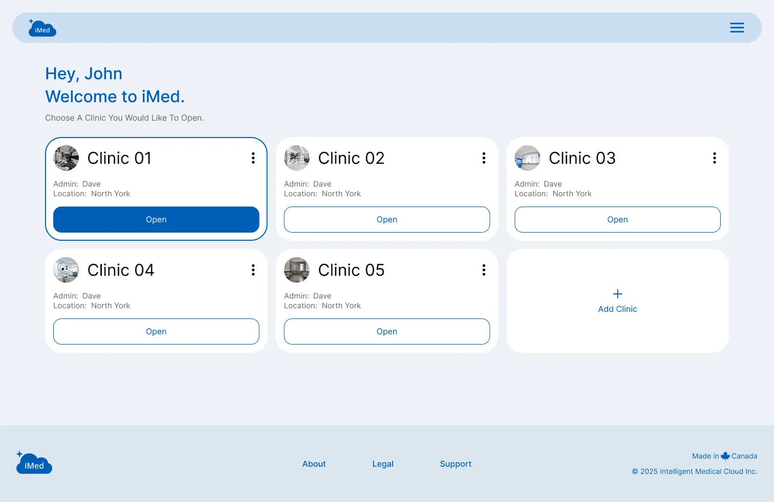
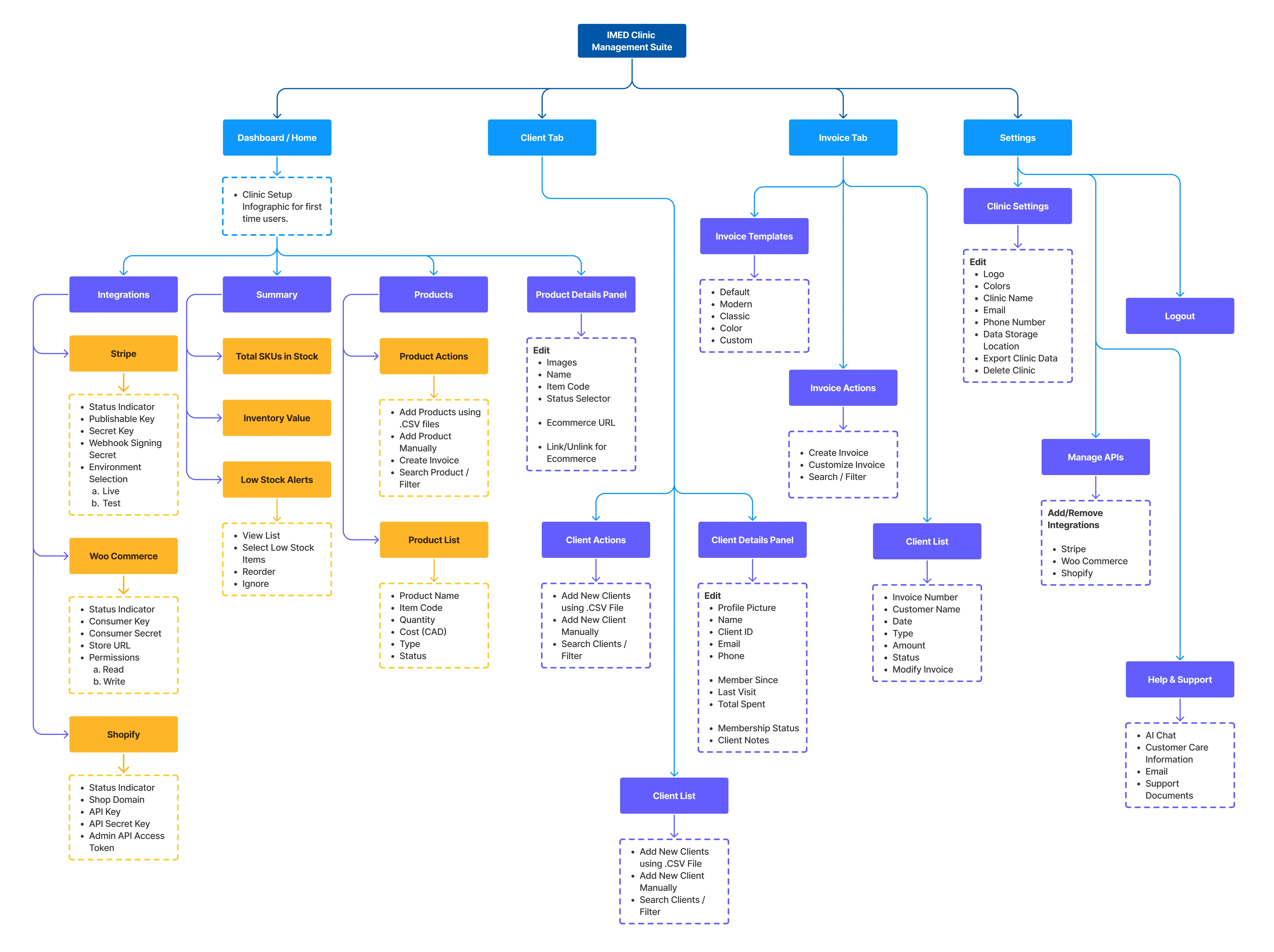
The architecture centers on a clinic selection screen (the hub), with a dedicated Clinic Management Suite (a spoke) for each location.
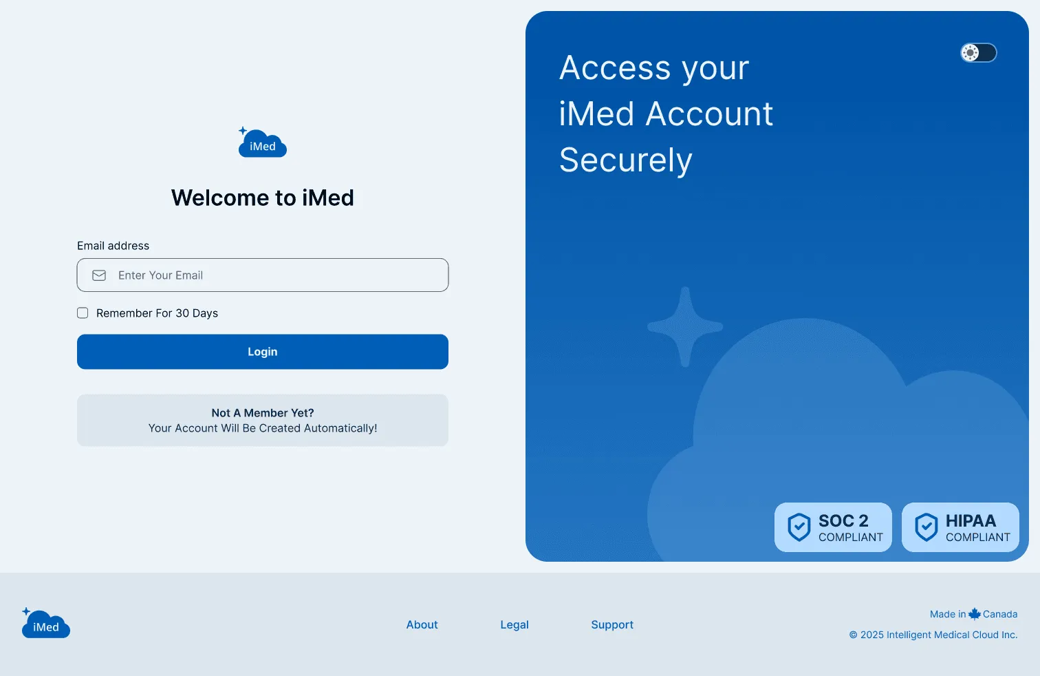
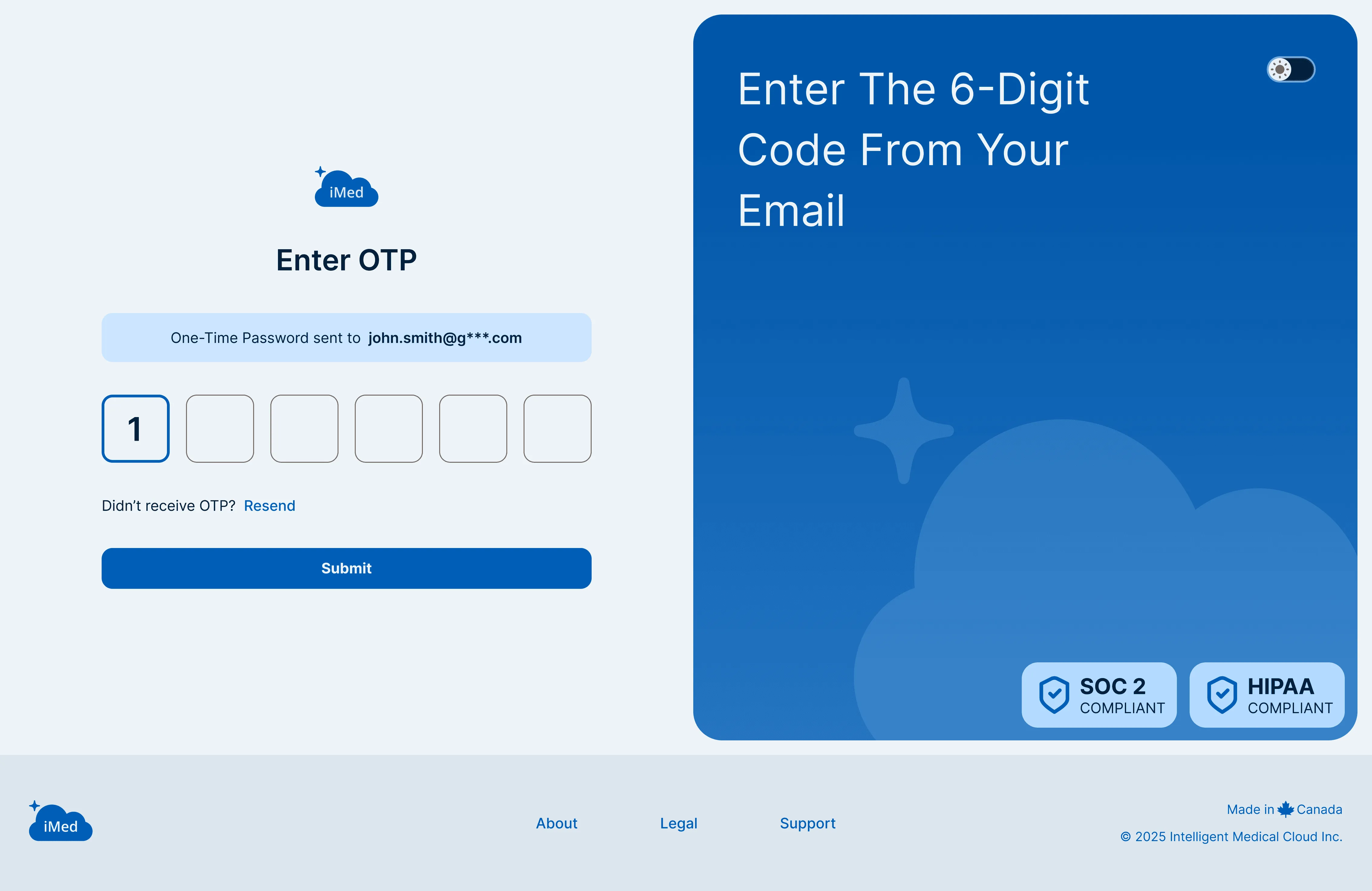
- Security perimeter: a HIPAA/SOC2-compliant gateway with 2FA and regional server selection (Canada, USA, or Europe).
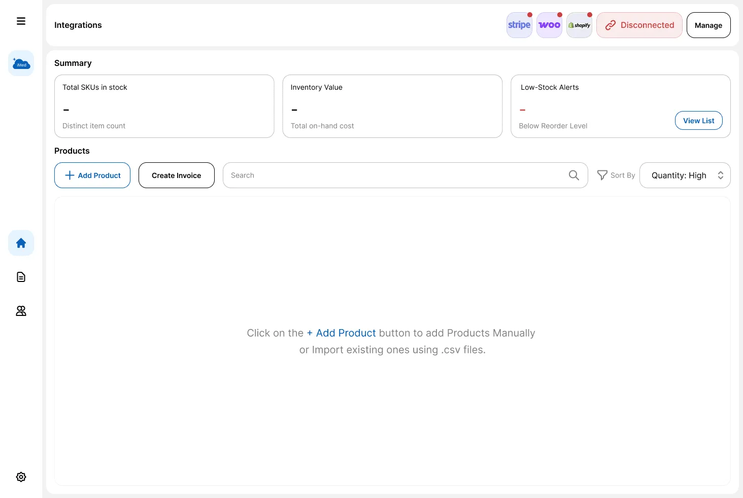
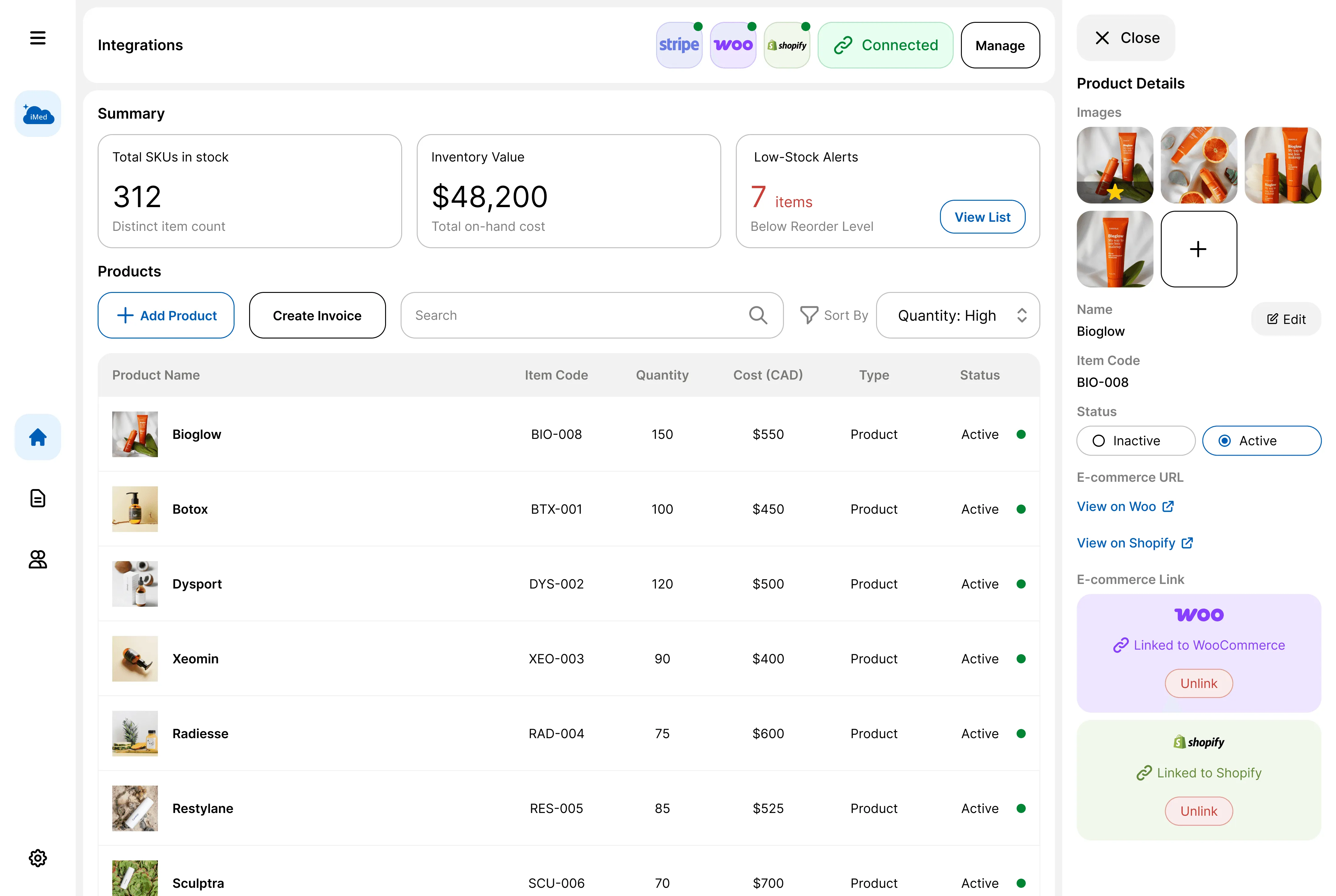
- Zero-friction management: spatial continuity over disruptive modals. The header shows API connection status, and a side drawer reveals edit options without users ever losing their place.
Solution
One operating system for the clinic
- Contextual side panel: clicking a product or client record opens a right-hand panel instead of a pop-up. The list resizes to make room, so admins can edit medical notes or link SKUs while the master information stays visible.
- Integration status: the header shows real-time sync health for Stripe, Shopify, and WooCommerce.
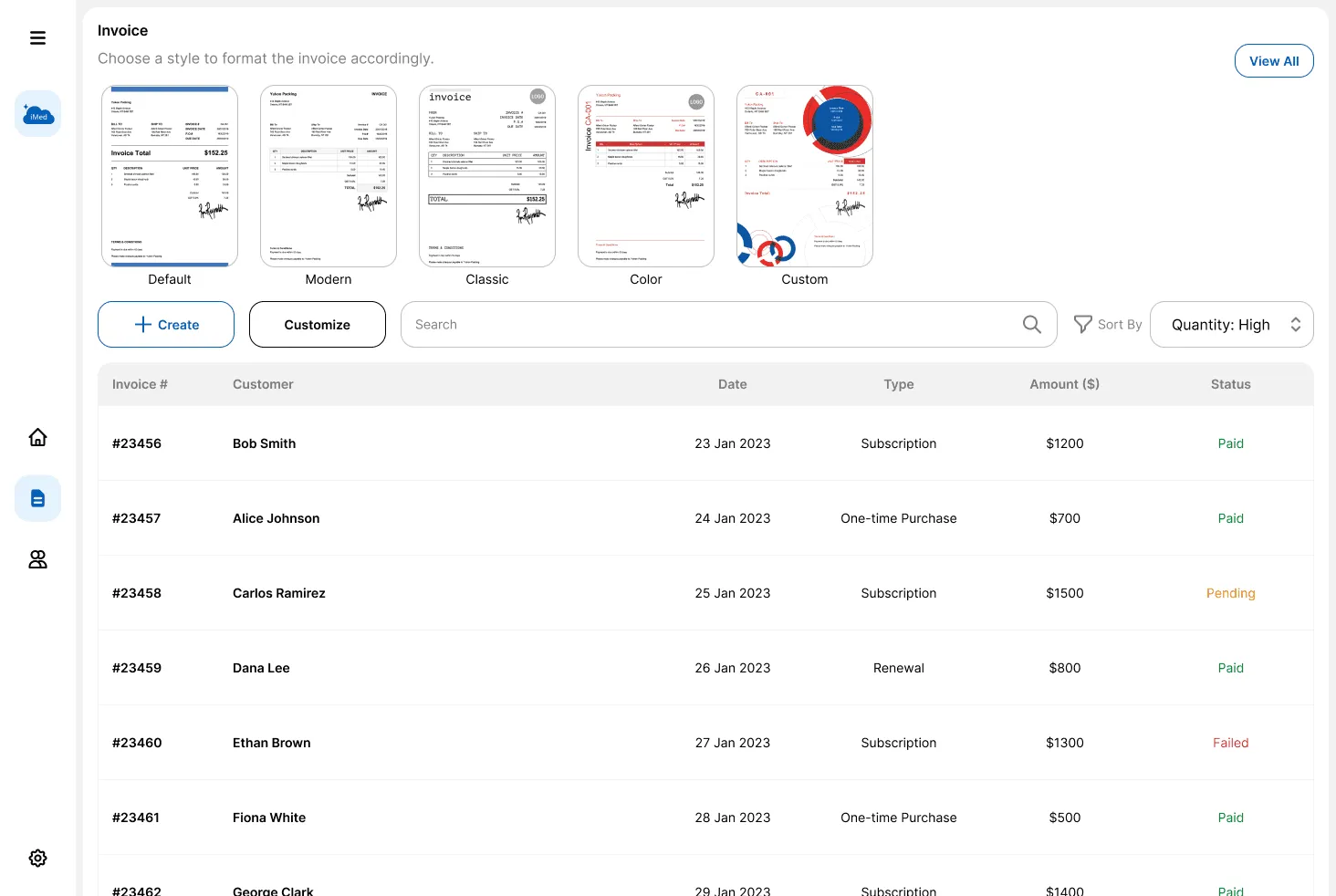
- Automated billing: connected to Stripe, the system generates branded invoices the moment a sale is made on clinic POS machines and emails them to clients automatically.
Design system
Performance-driven foundations
As a solo designer, I built an atomic design system to keep 50+ custom screens consistent.
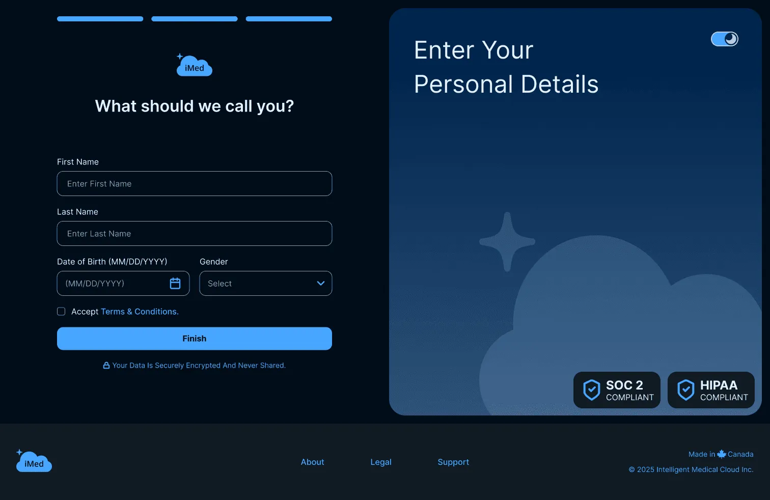
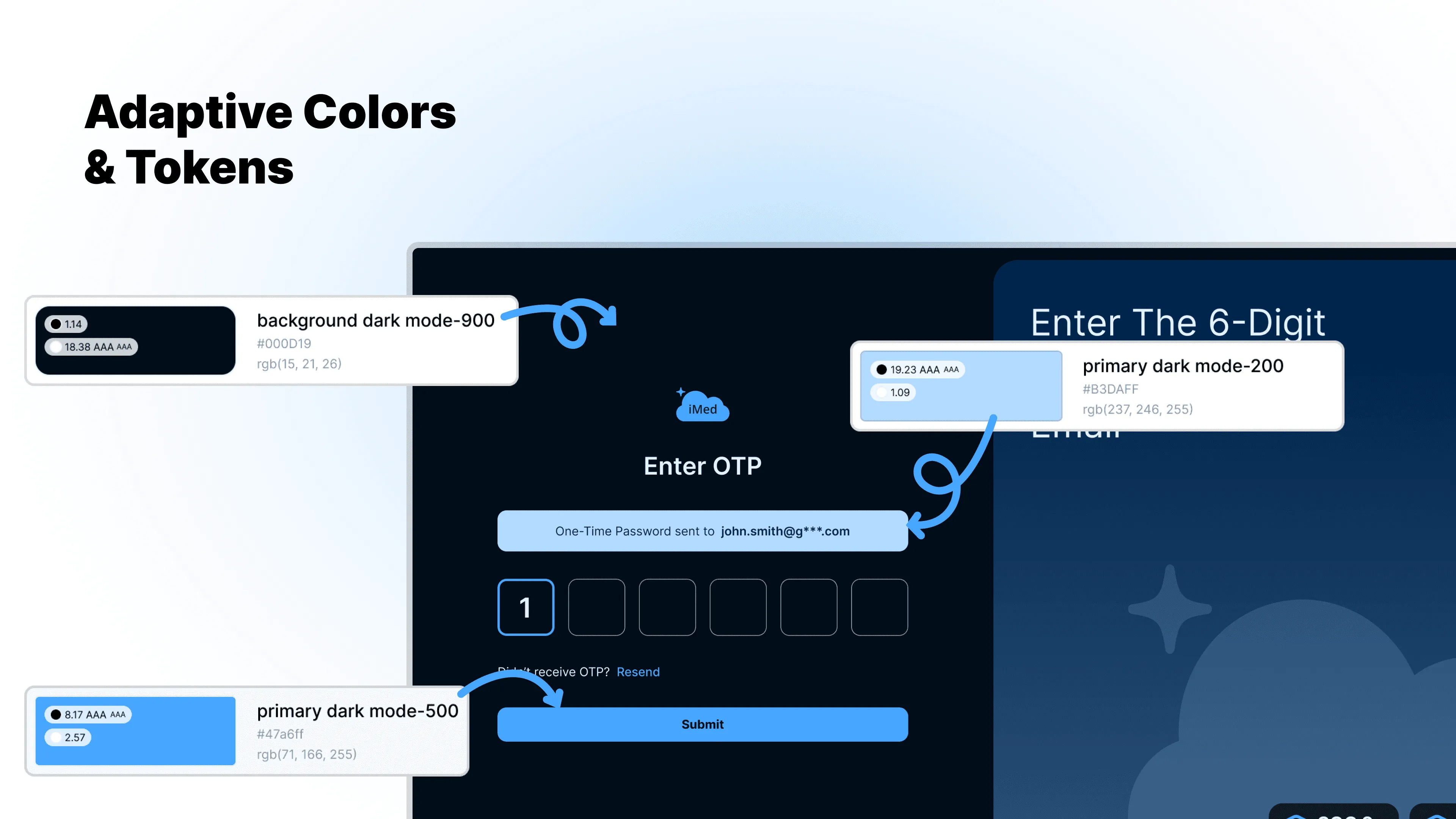
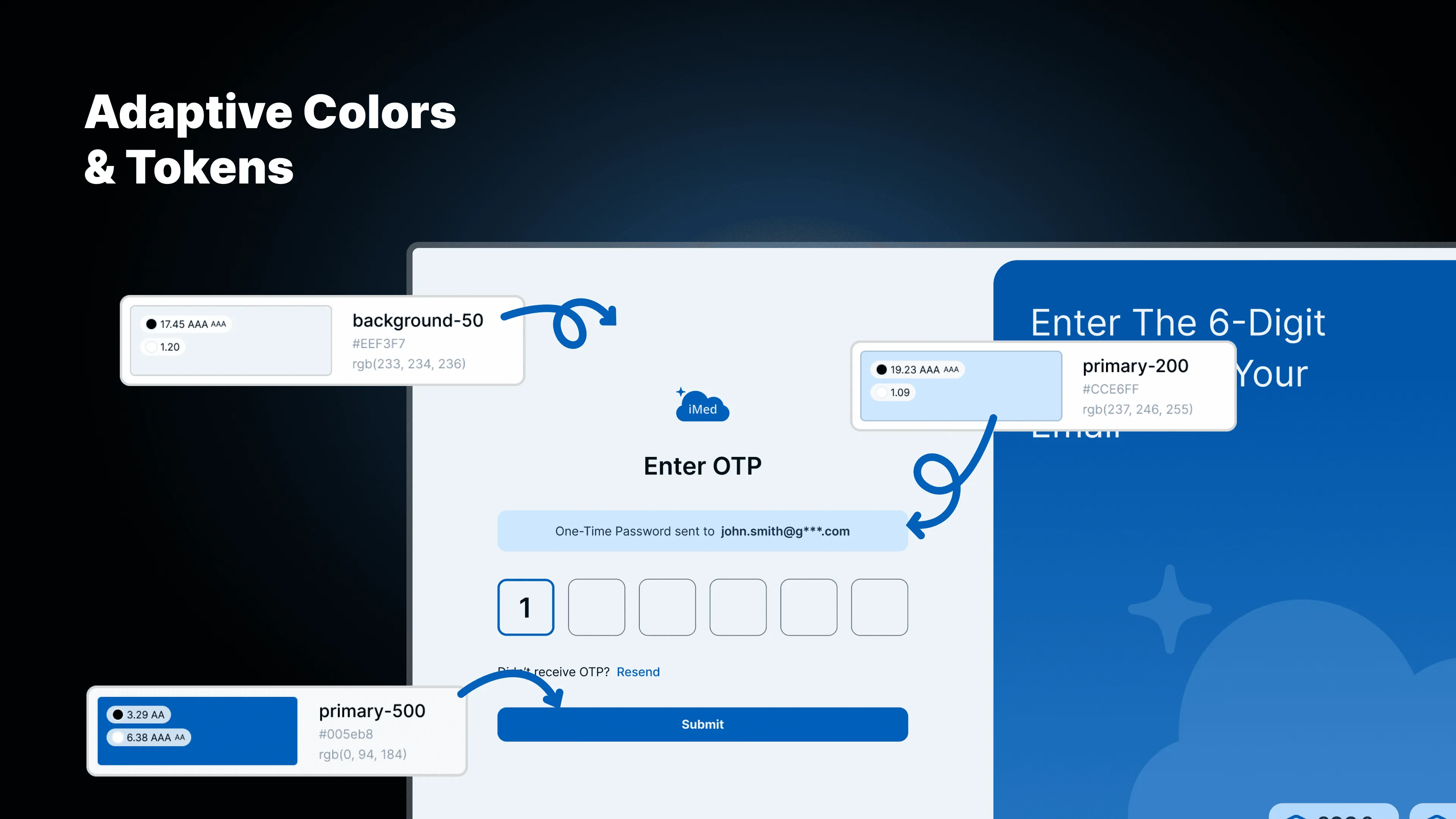
- Adaptive colors & tokens: a semantic token system for seamless light and dark modes. Every token was tested against WCAG AA and AAA for legibility in varied clinical lighting.
- Atomic blueprint: a strict typography scale and a full sticker sheet of components made developer handoff seamless.
Results
From registration portal to business operating system
In six months, iMed grew from a simple registration portal into a working business operating system. Balancing the constraints of external APIs with a clean interface, I prioritized data flow and operational clarity.
- 10+ hours saved weekly: two-way sync stopped the revenue leak, saving the time admins spent on manual stock updates.
- 15% faster payments: automated Stripe invoicing and email delivery reduced late payments.
- 1500+ patient records: optimized pagination kept load times under 2 seconds, even for clinics with large patient databases.
What I learned
- API-driven design: as the sole designer on a technical product, I learned the UI is only as good as the data flow. Understanding how Shopify and Stripe APIs communicate was vital.
- Systems over screens: a design system built early saves hundreds of hours. The token-to-UI workflow let me redesign the entire invoicing suite in three days with full consistency.
- Trust as a feature: in medical tech, visual design must reinforce security. Small details like HIPAA and SOC2 labels in onboarding reduced friction and raised sign-up completion.
- Familiar patterns win: the card vs. list test showed that breaking established patterns adds cognitive load. “Modern” layouts that sacrifice utility slow users down.
Final screens
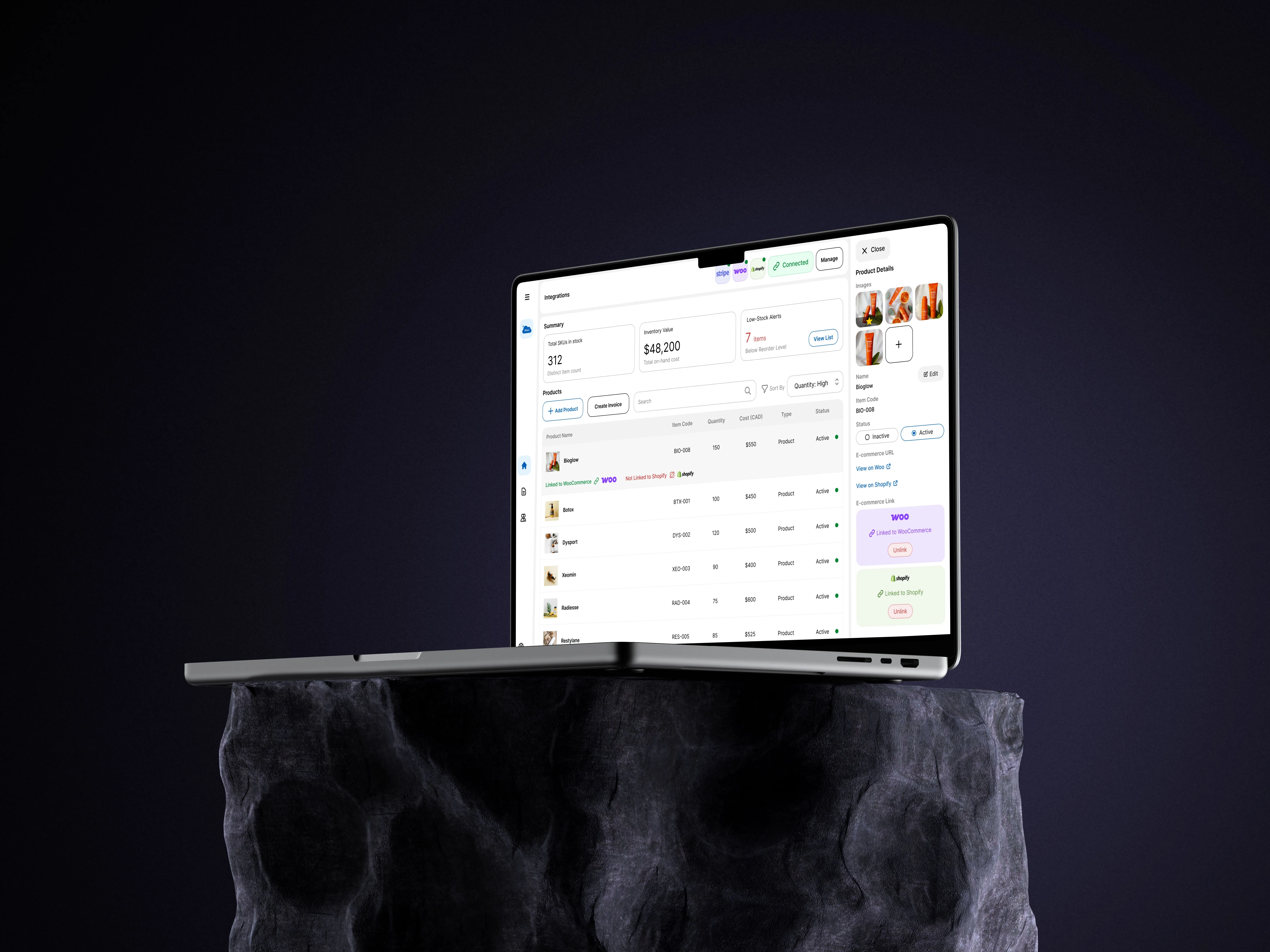
From the secure login gateway to the fully populated Clinic Management Suite dashboard.