Problem
The friction points
Submitters. Applicants spent 15+ minutes per application, repeatedly typing identical personal and academic details across dozens of scholarships. Result: high drop-off rates.
Admins. Admins lacked modular tools. They had to manually recreate new forms from scratch for every scholarship category, even when 80% of the questions were identical.
Reviewers. Without automated filtering, reviewers wasted countless hours manually evaluating submissions from applicants who didn’t meet basic eligibility criteria.
Solution
1-click apply for applicants
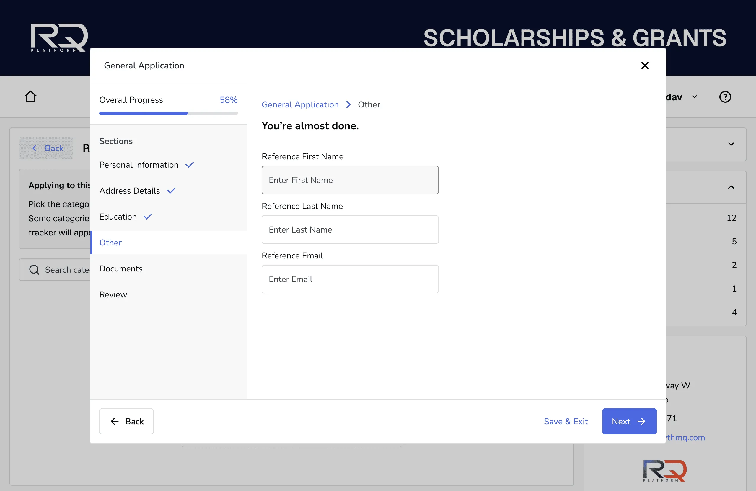
Applicants answer common questions once. If a scholarship requires no extra information, they apply instantly with one click. If it requires more details, a short popup asks only the missing questions.

Modular setup for admins
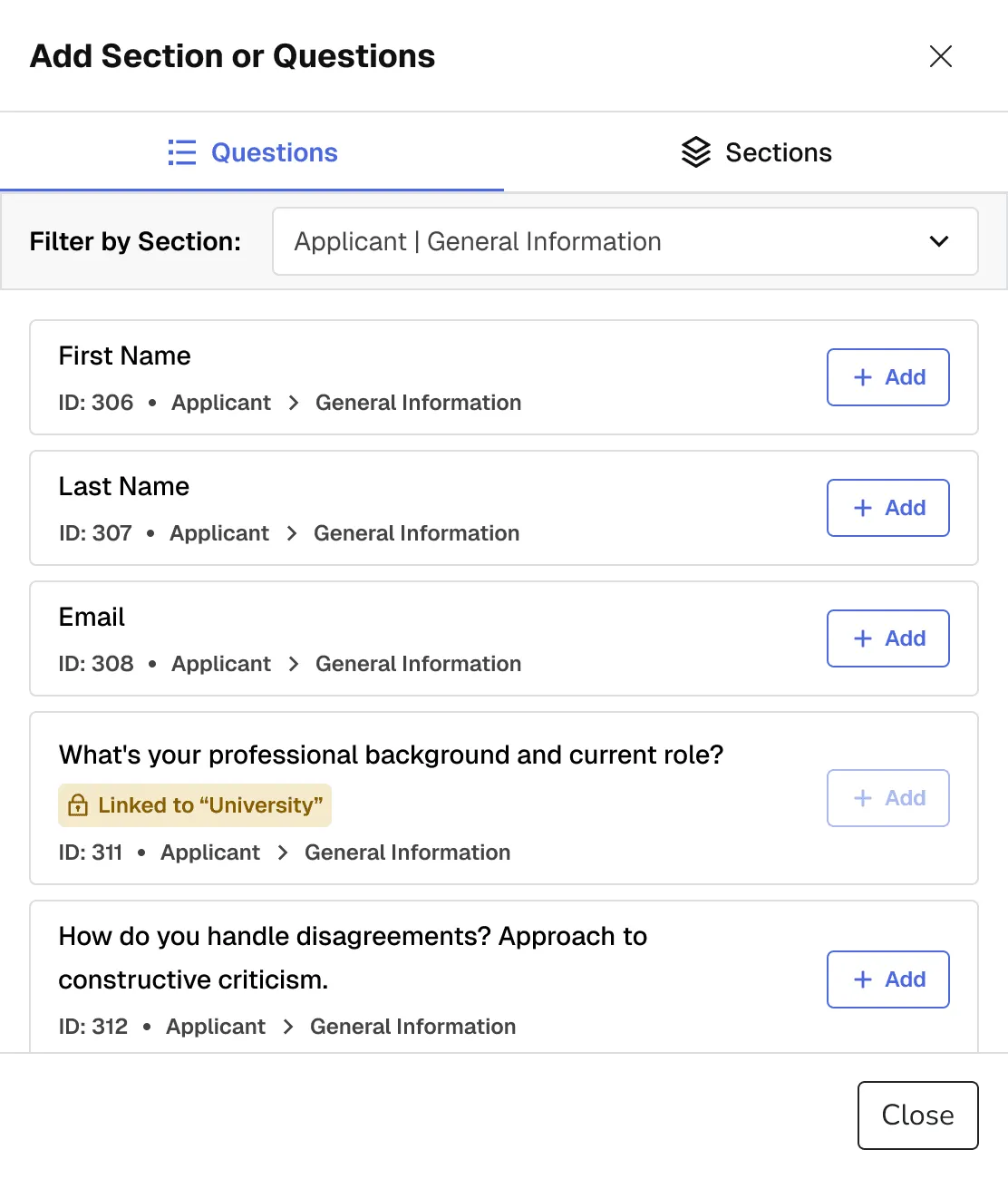
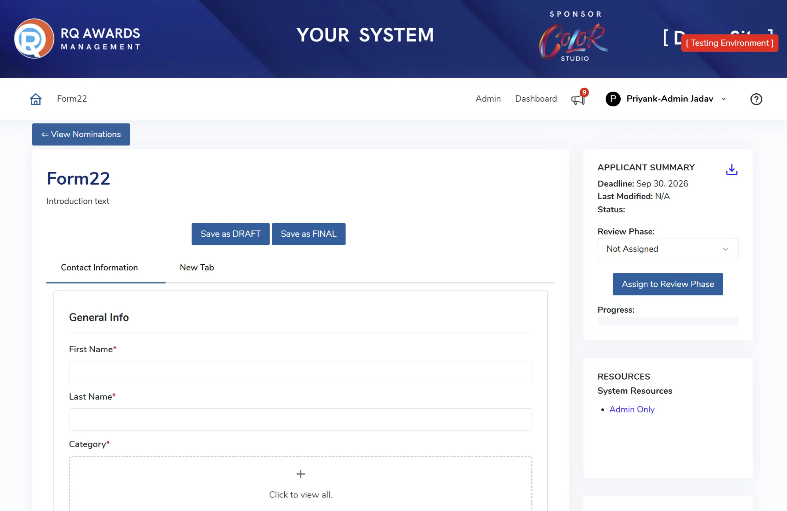
Admins create the main application form once. When adding a new scholarship, they only type in the unique questions for that specific category instead of building a whole new form.
Automated filtering for reviewers
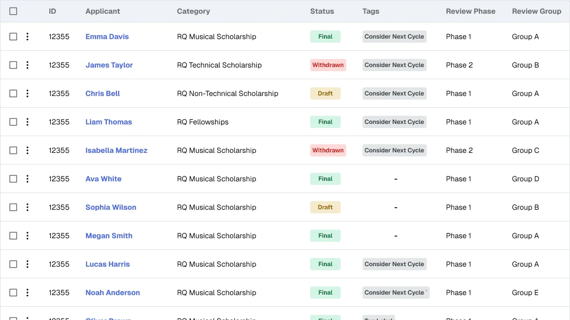
The system checks the applicant’s initial answers and hides scholarships they do not qualify for. This ensures reviewers only receive and read eligible applications.
Before and after
Design system
Multi-brand atomic design system
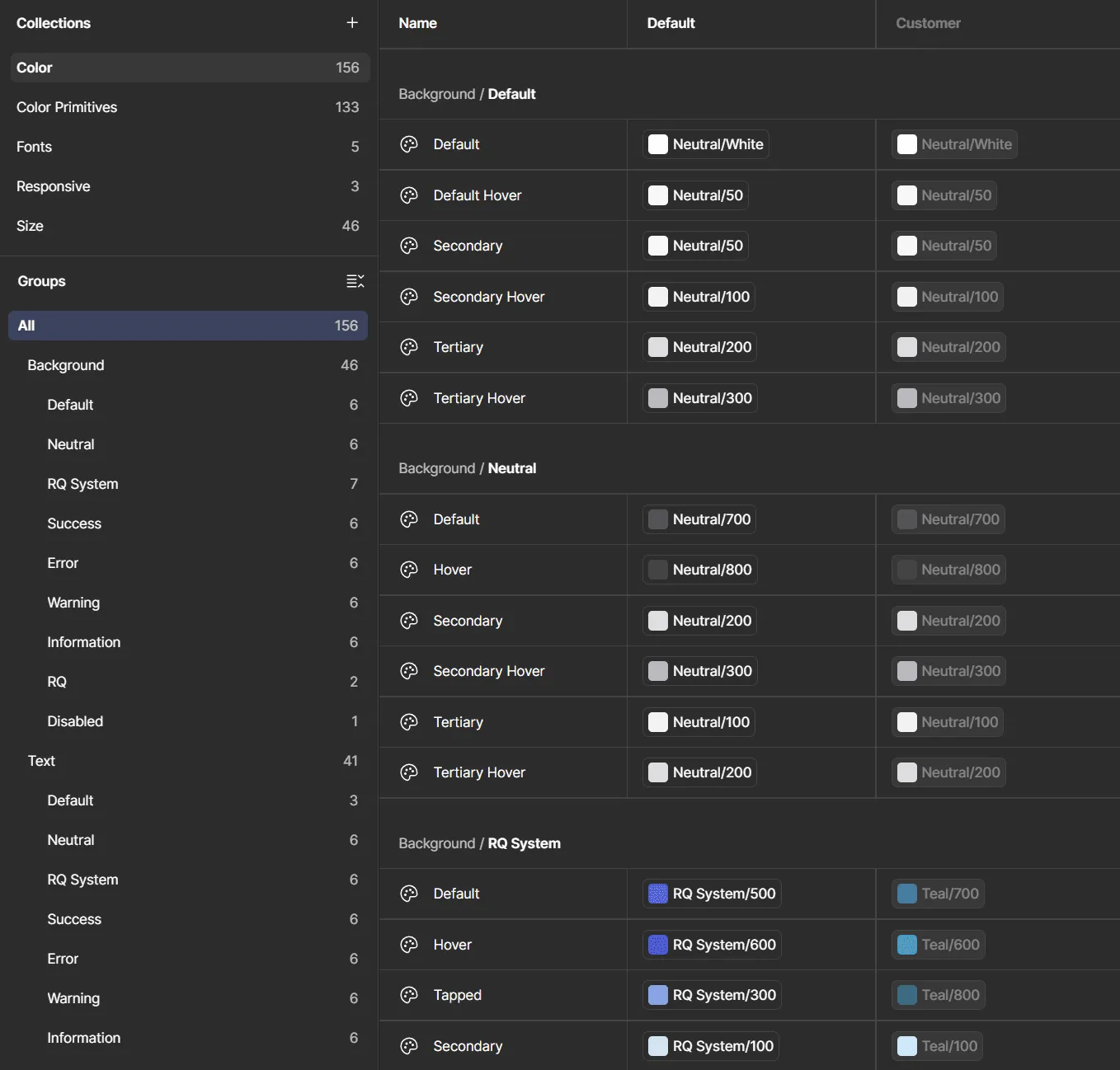
I built a scalable component library using atomic design principles, structuring elements from base atoms up to complex organisms. A rigid foundation of primitive and semantic tokens, paired with multi-mode Figma variables and nested instances, allows instant, automated white-label skinning for new clients. Accessibility was baked into the core properties of every component. To ensure a seamless engineering handoff, I integrated strict usage guidelines and technical annotations directly alongside the UI.
Accessibility
Accessible components
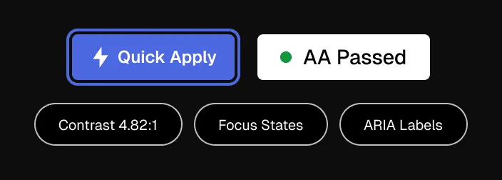
I tested all text contrast, button sizes, and form inputs to ensure the platform is fully accessible and meets strict WCAG guidelines by default.
Takeaways
Fix the root problem. Improving the applicant experience meant we had to fix how admins created forms first.
Centralize data. Asking for shared information once stops users from abandoning forms.
Tokens save time. Setting up design tokens early made it much faster to launch new client themes.