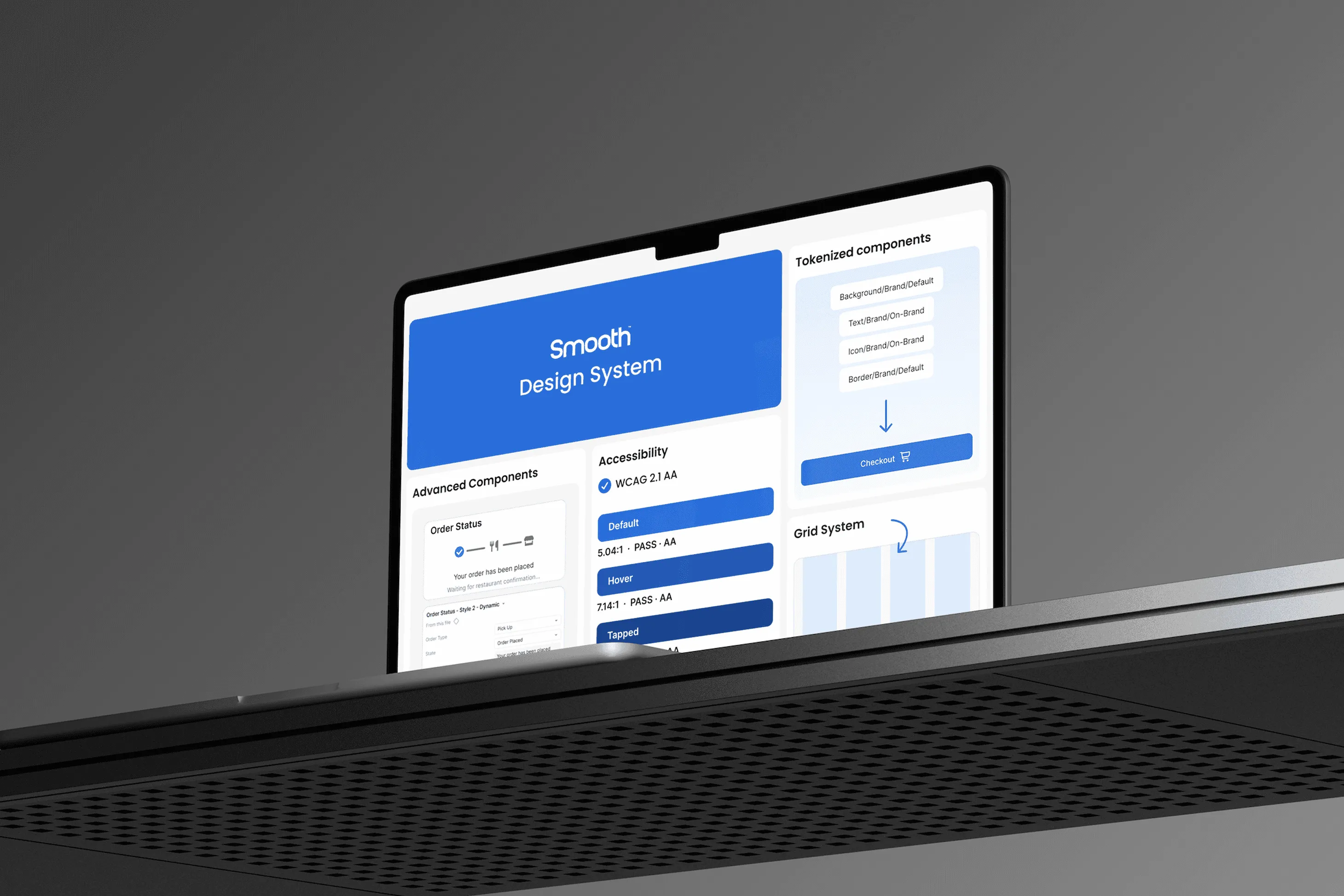
My role
As the product designer for the design system, I crafted, monitored, and measured the system for web and mobile platforms. My responsibilities ranged from establishing design foundations and developing components to formulating design guidelines and design tokens. I also created detailed accessibility documentation to guarantee a seamless and consistent user experience.
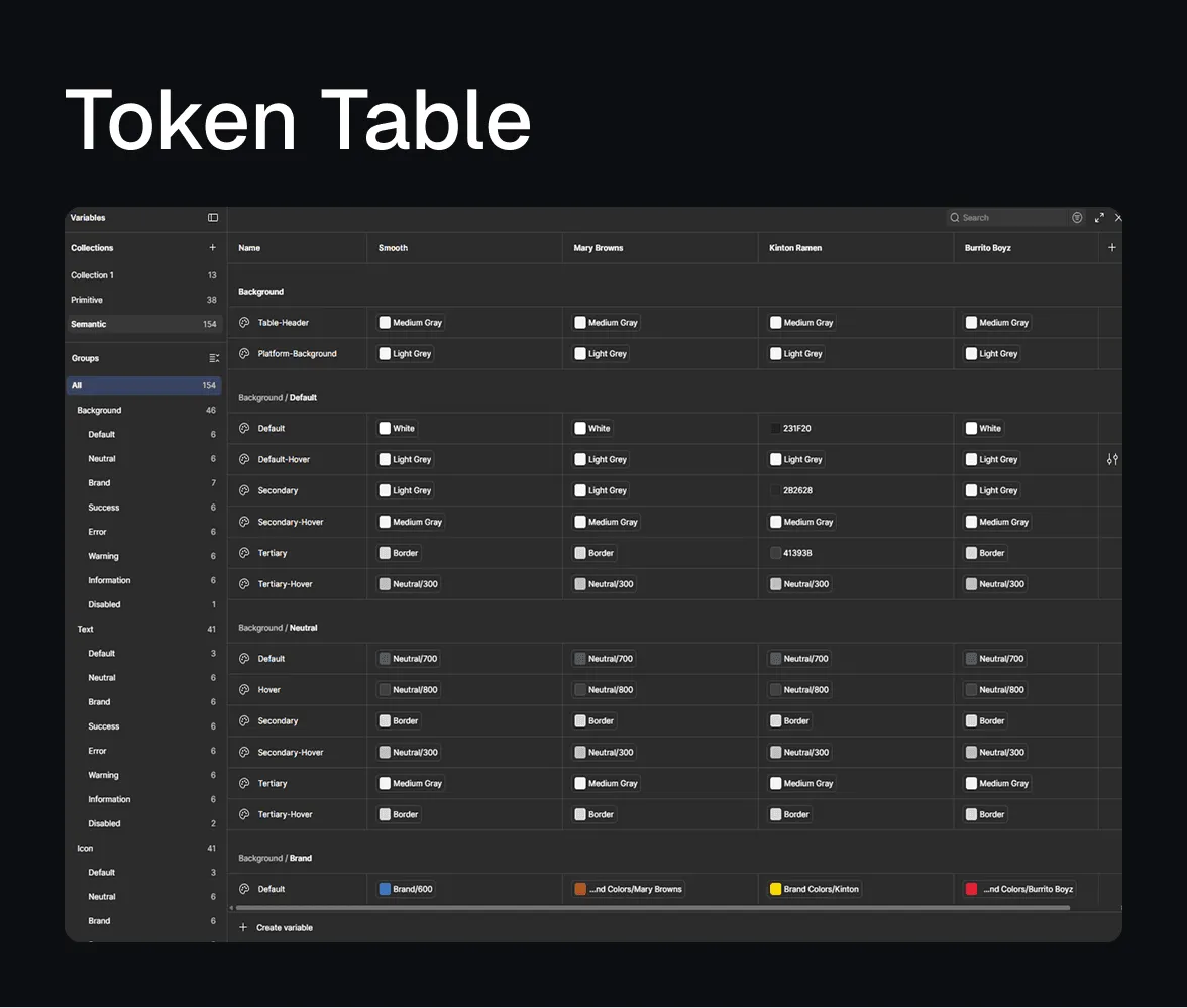
Design tokens for easy theme switching
Smooth Commerce offers a variety of products across distinct client themes. A token structure flowing from primitive to semantic values lets us switch between themes effortlessly and makes component development more efficient. By simply replacing primary and secondary base colors and adding fonts, we cut the repetitive work of adapting individual elements.
Scaling the system with variable modes
We built templates early for high-touch areas like menu styles, loyalty hubs, footers, and headers. With Figma variable modes, applying a client brand is now fast: dragging a standard layout into a client-specific frame adapts the colors, fonts, border radii, and dark mode preferences without manual work.
A new library for standard flows
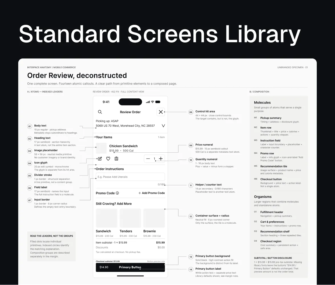
To establish consistent components and a unified style, I built the design foundation, component library, and token library from the ground up. Marketing sections stay customizable, while transactional flows such as order review and checkout are strictly standardized using atomic elements, so they work reliably for every new client.
Inclusive and accessible
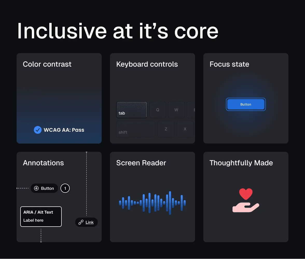
Built to align with WCAG guidelines, accessibility is part of the system’s foundation. I tested variables for strict color contrast and designed highly visible focus states for logical keyboard navigation. To keep these standards through handoff, I embedded accessibility annotations directly in the Figma documentation.
Behind the scenes
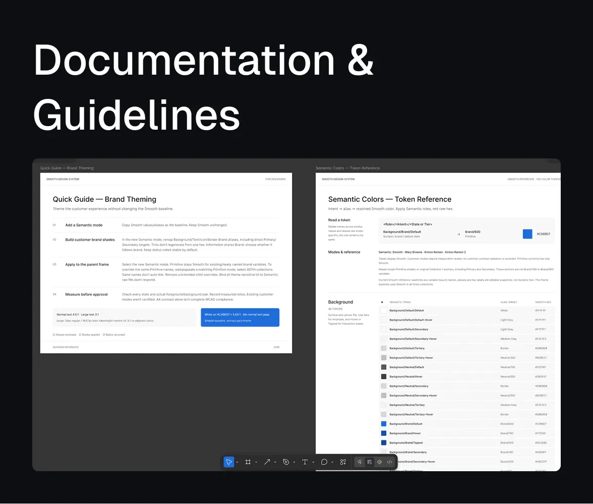
All documentation lives inside Figma, keeping the source of truth in the workspace. Every component includes technical annotations defining its role, use cases, and the exact variable tokens engineering needs.
How the impact was measured
- Faster client onboarding: measured by the reduction in days from project kickoff to engineering handoff, achieved by replacing manual asset creation with automated variable modes.
- Reduction in design time: tracked via sprint velocity. Designers no longer spend hours on repetitive UI skinning, freeing capacity for bespoke marketing campaigns.
- Standardized transactional flows: verified through codebase audits. Every client uses the same checkout and ordering logic, eliminating visual and functional QA discrepancies.